In what ways does your media product use, develop or challenge forms and conventions of the real media products?

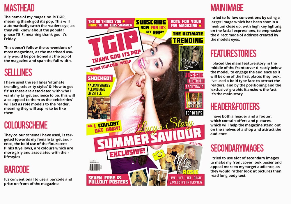
To keep my magazine in style with the modern magazine conventions, firstly I created a house style, this included making a colour scheme and using it throughout my magazine, the colours I used reflect throughout my magazine, creating a fluent and continuous brand identity. This matches the connotations of other popular magazines, which really emphasizes the professionalism of my product.

I also used large blocks of colours throughout my magazines. I feel that the neon pink grabs the attention of my audience, and will lure them into buying the magazine as it will be a favourite colour amongst my target demographic. As you can see above the again follows the conventions of pop magazines, and is effective as it is used by some of the most popular companies in the genre.
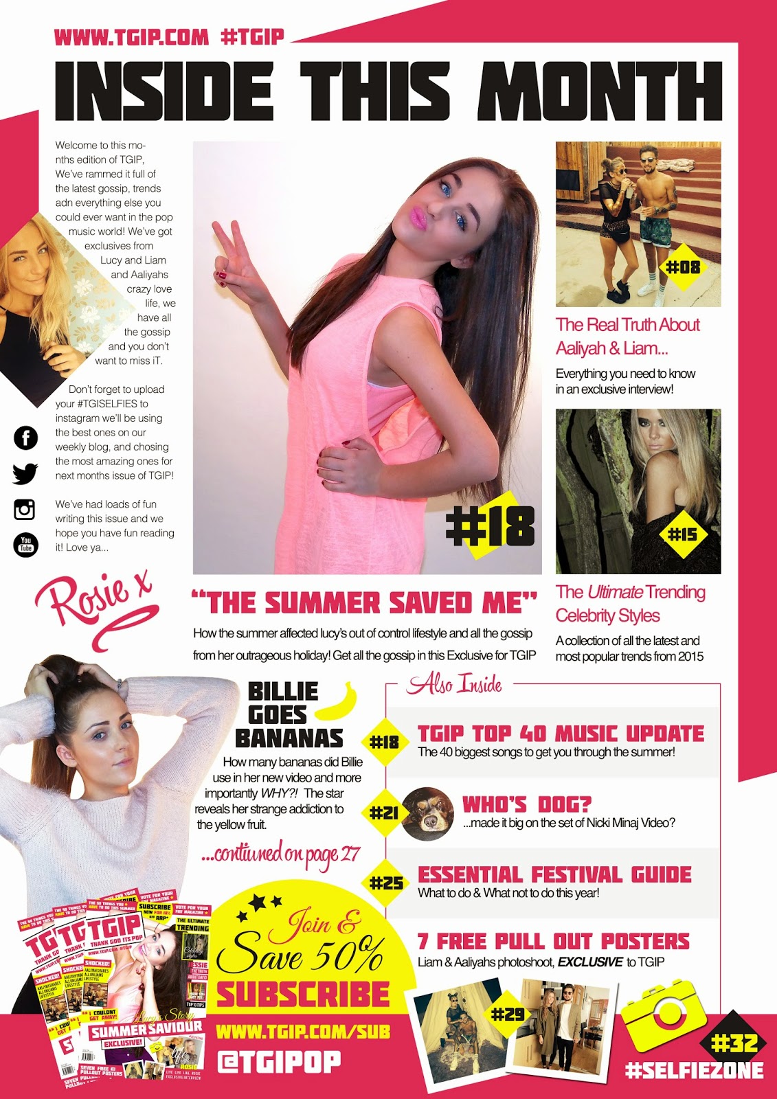
By using the same model/artist as the focus for my main story throughout my three pages, it will attract the audience through using the model as a role model and aspiring to learn her story. This also follows conventions of a pop music magazine as this is the hook for the audience to buy the product. I have placed here ‘center stage’ on all pages, where she dominated the front cover, contents page and DPS. This is a key feature of the pop music genre as it’s the stories of the most popular artists that will grab the attention of the target demographic on the shelves.

By using the same fonts throughout the magazine, it also emphasizes the continuity through my product, it follows the conventions of most pop magazine, using heavy font’s for the headings the hook the audience. Smaller body text has been used which is easily readable by my audience, I have also used short sell lines, and a Q&A to not bore my reader, as my audience are younger it will enable them to get the information they want, without them losing interest.
The page numbers reflect the content within my magazine, as you can see by my contents page, the pages which refer to my double page spread are the same again emphasizing the continuity throughout my magazine, I have also used the same sell-lines throughout my magazine, the word ‘Exclusive’ has been used on both the front page and the DPS, to anchor the audiences intentions as they will flick through to see the main story, as the word is highlighted on both sections of the magazine it will easily be noticed by the audience in shops and on the shelves. By using this form of continuity I feel it’s a great way to grab the audiences attentions straight away on the shelves. This again reflects the conventions of pop music magazines.
The following conventions analysis is what I did at the beginning of the year, about an existing magazine called we love pop...

The following are conventions analysis of my magazine, I tried to stick to pop magazine conventions to make my magazine profitable & hopefully create a strong fanbase...


The following conventions analysis is what I did at the beginning of the year, about an existing magazine called we love pop...
The following are conventions analysis of my magazine, I tried to stick to pop magazine conventions to make my magazine profitable & hopefully create a strong fanbase...
How does your media product represent particular social groups?

By using a young female on the front cover as the cover star of my magazine I was able to appeal to my target audience who are of a similar age and gender to my cover star. I have represented her as a fashionable, attractive and popular, by both the photography, editing of the image and the sell lines on the main cover, this will appeal to my audience as they are of the age, to have strong interests in the lifestyle I have portrayed my cover star to have. They will use her as a role model, and aspire to live and learn about her lifestyle.

I believe that my magazine represents similar groups to what magazines such as ‘We Love Pop’ Target, I believe my magazining gives of the same connotations through both the camera work and the general layout of the publications.
By using bright high key lighting to emphasize the glamour of my cover star, and the medium shot to emphasize both the beauty and the style of the model, it will appeal to my target audience again through using them as a role model. The summer clothes used in the images, will appeal to them through nostalgic memories of the summer before and may lure them into picking the magazine of the shelves.
By using bright high key lighting to emphasize the glamour of my cover star, and the medium shot to emphasize both the beauty and the style of the model, it will appeal to my target audience again through using them as a role model. The summer clothes used in the images, will appeal to them through nostalgic memories of the summer before and may lure them into picking the magazine of the shelves.
The mise-en scene I have created through my design, may represent the wild and exciting lifestyle’s of my target audience, and also give of the impression of the magazine being filled with lots of content to emphasize the value for money aspect I try to portray, this is again anchored by the graphic on the top of my publication behind the model. This is due to the fact my audience will be money conscious due to their lifestyle.
I have also used bold and bright colours to represent the pop music industry as its very loud, and catches the attentions of lots of people, I have tried to portray this though my cover star and her outfit and the sell lines and stories around her anchor this idea.

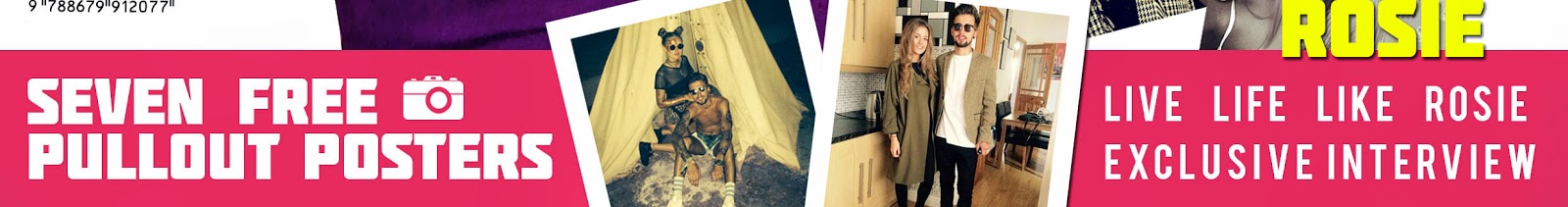
My audience is in the lowest category which is 'E', this is due to the fact they have no disposable income i.e they are either attending school or college. I have included sell lines such as 'Seven Free Pullout Posters', not only to lure my audience into purchasing my magazine but also enable them to get posters of their favourite artists with no extra charge.
I also included a '10% Off' when subscribing, to entice my readers, my magazine price is low which has been set to the social group class E, but with 10% off it makes it even easier and affordable for my target audience.
The sections below are of my front cover are specifically appealing to my target audience, as my social demographic are young and therefor most will be without a job and money will be short. The pull out poster will act as a lure, enticing them to purchase the magazine as they will think they are getting more for their money, not just the content but also free posters they can use in their rooms of their favourite stars, that will act as role models to them.
I have used a 'Subscribe now for 10% off RRP Price', as this entices them to read it as they are getting it at a cheaper price. It also promotes the online magazine, as you can also read the magazine on another platform, which both enables the customer to read the magazine on any device, and also saves on printing costs, and money can be made through pay-per-click advertising. I have highlighted this section of the magazine in yellow, to help it stand out on the page as price is an import factor to my target audience, so highlighting the fact they can save money, may lure them in to subscribe to the magazine, guaranteeing sales.

Who would be the audience for your media product?
The main target audience for my media product, is girls ages 11-19 interested in the pop music industry, I have tried to focus my attentions towards this audience by using Q&A’s, Gossip, Female Models and Relationships. All of which will appeal to this age range as it’s part of their everyday lives.
I have targeted the ‘School Girl/College Girl’ age as it will also create a sense of advertising through word of mouth, talking to their friends about the stories they read in TGIF will be a great way to get the name about with no costs at all. This demographic would also be using social media sites such as Facebook, Instagram & Twitter which would be a way I would be able to engage with my audience through various platforms to again push an online fanbase which would be sharing stories from the blog to their personal social media accounts again pushing the free marketing plan.

By using female artists in my magazine it will attract the target market due to the fact that they will use the star as their role models and want to know everything and anything they can, this is again anchored by the bright pinks and yellows, which give strong connotations of females.
The secondary target audience for my product would be parents of the main target audience either picking the magazine up for them in a weekly shop or coming across it, by also targeting them by the bright colours and big names to draw them into thinking about their child/children. These would fit into the demographic of B,C1 & C2 social brackets as the magazine would be circulated in stores which would apply to the such as supermarkets, newsagents and through an online blogging service.
I have also portrayed the pop music genre fans to be interested in fashion, relationships, fitness and celebrity lifestyles …

Throughout my magazine I have tried to continuously stick to the colours that appeal to my audience, I also wanted to use colours that related to my feature story, mentioning summer, therefor I used the colour yellow which has indications of summer.
I asked my focus group various questions on the look and feel of my magazine and how it would apply to a target audience, you can see the results in the video below.
What kind of media institution might distribute your media product and why?


The media institution that would distribute my magazine would be BAUER Media Group, as they are the largest privately owned publishing company in the world, they already publish music magazines such as Kerrang and Q, although these magazine don’t target the exact same target market as mine, I feel that the way they access their demographic through both the magazines and the brand through other platforms such as Social Media & TV, it will give my magazine the wide spread reception of an already strong fan base.
As the company also own Kiss FM which is another way of advertising to my target audience, through mentions on the radio which will target the same audience that i’m trying the capture, it also widens my audience to the hiphop/r&b fans who hear stories from my magazine through the radio and get drawn in through curiosity and search for my magazine online.
Another way of distributing my magazine could be through shops such as Topshop, H&M, River Island, etc… All shops of which my target audience will be visiting, by positioning them at the door, it guarantees the passer viewing at least twice which also may lure them in to pick up TGIP and buying it. These specific shops would be great as it’s the shops which my demographic often shop at, my magazine could also be introduced as a freebee for with purchase in these stores as a way of getting the name out, although this would create a loss at first, it would boost brand identity and maybe increase sales in the future.
Another way would be through an online blog and website, this again widens my consumers, due to stories being shared on social media sites, literally anyone could end up landing on my site, it would also bring in a second income through Pay-per-click advertising through using software use as Google Ad words. The blog would also be a great way to interact with my audience, through competitions, comments, forums & videos, it will allow me to communicate with my demographic to deliver them exactly what they want.
I would also try to electronically distribute my magazine online, This would also incorporate things such as Video's on my featured stories, drawing a wider audience in from another platform, this would also enable my core audience to interact with my stories, through comments and social media activities. As my social class group is E, I've put a discounted subscription advert on my magazine making it cheaper and easier to access online, instead of going to a shop to get a hard copy. This also enables me to send out, monthly email shots, which give my fan base a reminder of when the magazine is being released, and where they can buy it, this could also enable me to give previews of content, interviews and stars of the up and coming publications, building up a hype about the next issue before release.
The new revolution is online technology and social media, I would like to incorporate my magazine into that platform because of the amount of people using social media, which you can see below.

Social media is also a good place to get my magazine recognised and built the brand identity, catering to and mass audience rather than just my target audience.

If I was to electronically distribute my magazine, I would do it through a website which I have designed above. There is content varying from the feature stories in my main magazine, Q&A Videos and make-up tutorials all of which appeal to my target audience and will entice them into buying my magazine as they feel they are getting free content and more value for their money making the relationship between the artists and the audience stronger. I have placed other content onto the online magazine such as make up tutorial videos and a place to listen to the top 40, this will entice my target audience as they are getting more content. The social media links on the website sends you straight to the magazines social media site so when the website users click on them we are straight away getting free advertisement.
How did you attract/address your audience?

The main why I attracted my target audience was through my imagery, as you can see by the main image on my front cover I have used a direct mode of address through my models body language, I have taken the shot on the front page at a low angle, this creates emphasis on the power of the star. However I have created a very ‘open’ pose, which suggests that she is opening up to the audience and welcoming them into the magazine. The direct contact through her eyes also helps draw in the user and can help created a relationship between the consumer and my model without them even realising. Throughout the imagery in my magazine, I have tried to use image where the models are looking directly towards the camera, to again emphasize this feeling of a positive and welcoming atmosphere/relationship for the consumer.
This is anchored by the quotes on the front page, as they are not asking the consumer questions, however they create a sense of conversation as it would appear that the magazine is talking directly to them.
This theme flows through my magazine, to the DPS where the page has been laid out as a Q&A, this allows the consumer to put themselves in the interviewer’s shoes, and again anchors the mood of conversation between the consumer and my character.
I have also used an indirect mode of address through features such as ‘vote for your fav magazine’ and the ‘#selfiezone’ as this enables the reader to partake and get involved with the magazine without directly forcing them to.
I have tried to engage with my audience using various techniques, you can see some here in a deconstruction of my front page;

A way in which I secured that the name of my magazine would appeal and attract my target audience, is to ask 21 people who are within my target audience which one they would most like to see on my magazine. As you can see below, 'TGIP' got the most votes, therefor securing it's place as the name of my publication.


What have you learnt about technologies from the process of constructing this product?
One of the main parts of the technologies that I have used that I have learnt is using photoshop and it's various tools. I learnt how to cut out images from backgrounds, and use the various layer styles, and opacity tool to editing a retouch my images.
Another part of photoshop I learnt was using clipping masks, editing the type and creating mockups for the presentation of my final product. I feel that this has enabled to me create a more professional mise-en-scene and atmosphere in my magazine.
I feel that by learning these technologies on photoshop, it has enabled my magazine production to be more free flowing, and creating what I feel is a professional publication.

A technology I used was an olympus camera, I had difficulties when using this as it was set in Chinese, and I couldn't change it back, this gave me massive complications when trying to get the right focus, lighting and mode for my pictures. Because of this, when it came to doing my double page spread I had to retake some pictures as the lighting and quality on previous pictures wasn't up to standard.
When making my DPS, I also had difficulties trying to get the format and the layout to match previous pages in my magazine, I tried to look at existing Pop magazines to get inspiration from.

I had multiple attempts at creating a DPS and as you can see above this is the one that I thought matched the other pages. As you can see by the picture below I feel that the last one worked the best with the existing styles of the other two pages.

Looking back at your preliminary task, what do you feel you have learnt in the progression from it to the full product?

The main progression I feel that I have made in the process of my magazine project, is creating a much busier, yet sophisticated and professional mise-en-scene. I feel that the quality of my front cover has developed by both my growing understanding of music magazines after research, and the progression of my photoshop skills from start to finish. By both creating a fluent colour scheme, and choosing fonts that will appeal to my target audience I feel that the mise-en-scene of my final production creates a much more professional and appealing atmosphere.
Another feature that I have learnt is the optimisation and editing of images, I feel that the image used for my final production appears to be a lot more professional, this is due to both the editing and photography/lighting techniques I have learnt over the process of my production, I feel the better the image appears the more it emphasises and shows off the content surrounding it.
I also looked into blog on copy righting on how to write content/stories that would appeal to my audience, I then took this on by using shorter and snappier sell lines and story lines, to keep my core audiences attention, and not have them lose interest.

This is a ticks and crosses table to show what I did in my final front pages compared to what I had produced in my preliminary task, in my preliminary task I used quite a lot of conventions to an actual magazine, in this crosses table it shows what I feel I have done better in my main task compared to the preliminary task.
I used this video above, before taking the shots for my final production, I believe this helped me in getting my final product up to standard, which I feel shows when comparing the lighting in my preliminary task as I didn't use this technique for my first shoot. It took me a while to learn exactly where to place the lighting to capture the mood I wished to portray, as some positions the lighting worked and in other positions the lighting didn't hit my model correctly. Therefor I had to retake some images for my DPS as I didn't get enough/the right image in my first shoot.
I found at first when making my preliminary task that it was quite difficult to organise my time and getting things in on the deadline, however whilst I was doing my main task, I felt that I organised my time efficiently giving myself enough time to do each specific task. I think that this shows in my main task as you can see that it appears more professional and to a industry standard.
I think throughout the year, my photoshop skills have developed extremely, making me feel that I could experiment with my front cover, contents page and DPS, in comparison with my preliminary task where I didn't have the confidence in my photoshop abilities to try new things or take risks. As you can see below I experimented by placing images in my footer to enhance its appearance to the reader, luring them into buying it as it appears that they are getting more content.