Thursday, 22 January 2015

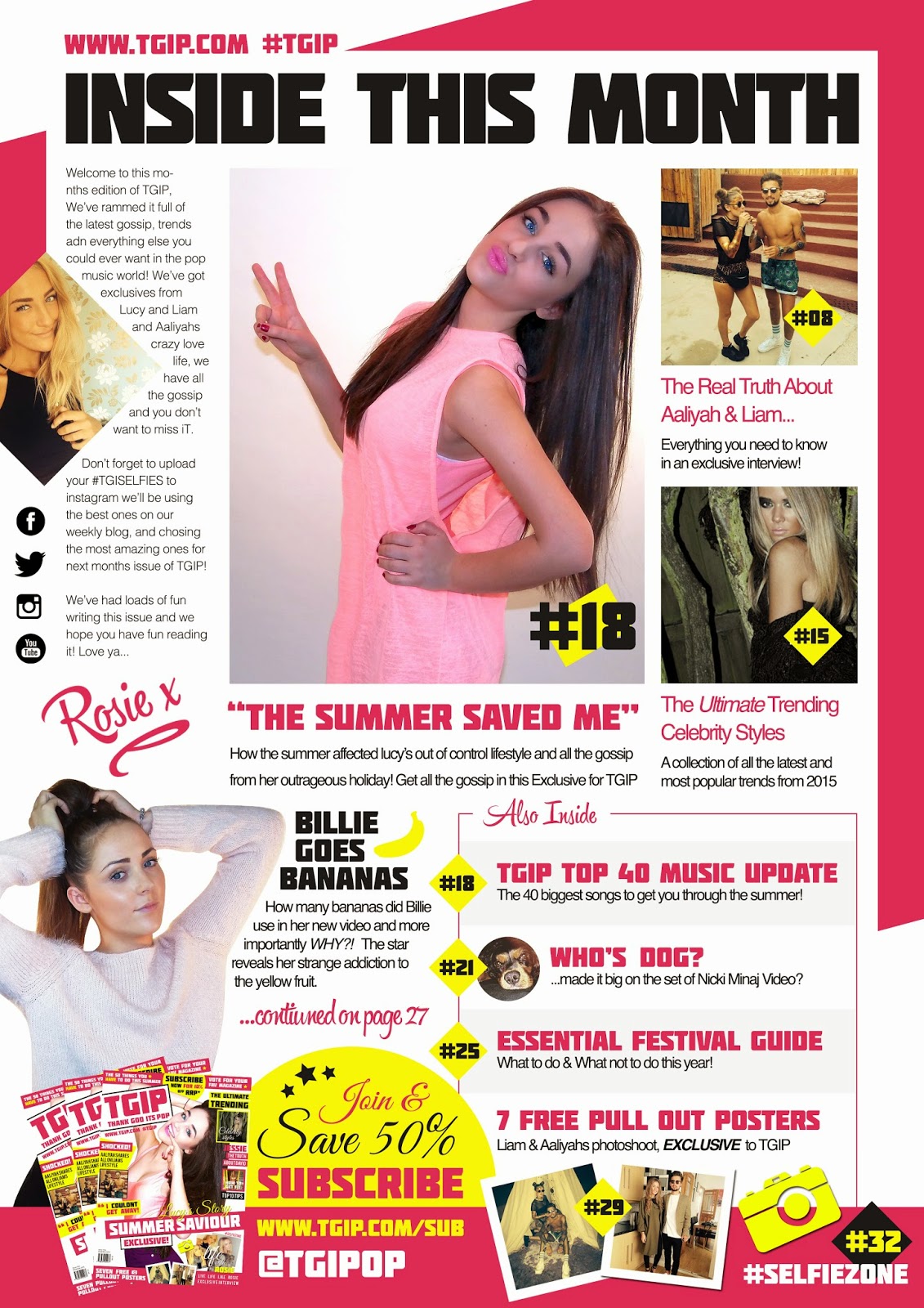
First draft of my Contents Page


I started doing my contents page like this but when I got half way through I realised that I didn't like my main image. I thought it stuck out to much on the page and even though that should be good on this magazine I think it ruined it. After thinking this I changed my main image to this.....
After changing my image image I think my magazine looked more realistic and conventional and now it looks like this.....
My contents page now looks like this which I think looks better. I still have a few changes to make.

Monday, 12 January 2015

How I made my magazine front cover draft


Firstly I added the edited Image to the A4 Size Canvas.


I then added the logo and used the pen tool to crop around my models face and delete that section of the logo to created the depth within the image.


I then created  the skyline under the layer of the model to make it appear as though it was behind my model.


I then added a shape over the model and added text, which I then used blending options to add a colour overlay and drop shadow to make it 'pop' on the page.


The next step I added another sell line, using shapes and text to highlight each other. I then created a square which I used a clipping mask to overlay the image within the shape. I then used blending options to add a stroke to the box to give it it's outline.


Next I added the bottom story using various images which I placed on top of each other to create the layered effect. I then added the text over the top again using blending options to add the drop shadow and colour overlay to make the text stand out.


I then added a footer again using clipping masks to frame the images, i then used text and a small graphic which I created in Adobe Illustrator. I then added more sell lines to the page as I felt some of the white space was wasted.


I then added the barcode and anchorage text so it followed the market connotations, I also added a yellow background to the sell line on the left to make it stand out more.


Finally I added the sell lines on the top right, using clipping masks for the images to keep them within the shapes, I also used stroke to create the outline. I then added the text and used the shape tool to create the backgrounds to highlight it.

Friday, 12 December 2014

Front Page First Draft (Using All Original Images)

Website Design for TGIP Magazine


I have made a draft website to show another platform in which i can distribute my product. My target audience use the internet a lot, this enables them to read the magazine, look at images and online videos in more detail. I have placed links on the website which will send you to the social media site you want to follow us on, social media is very popular within my target audience so this will enable my audience who read the magazine to follow us on different platforms and also giving us free advertisement. Even though the magazine is based in the music genre i have put make up tutorials on there as my readers will look up to the artists within the magazine and will want to look like them. I have made this exclusive to the online magazine enticing my audience to subscribe as you are getting more out of your money.

Test shots of Lucy

Thursday, 4 December 2014

Test Shots


These are a variety of test shots that I have taken for my magazine, as it was my first time using the green room and the lighting the pictures didn’t turn out as good as I would have hoped. As I have done this I have realised I need better quality pictures for my final main image on my front cover.

This is what my target audience think I should call my magazine